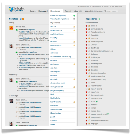
For far too long, the repositories drop-down has been far from optimal. Something of an embarrassment in fact. While not completely unusable, the drop-down is unwieldy for users with access to dozens of repos:

- Old repositories drop-down
Additionally, its appearance never really blew my skirt up.
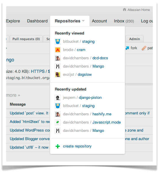
I’m pretty pleased with what we’ve come up with to address these issues:

- Improved repositories drop-down
We now limit the number of repositories displayed to ten. Ten relevant repositories. Plus, the drop-down is no longer an eyesore. Skirt. Blown. Up. (I hope yours is too.)
As always we love receiving feedback from other Bitbucket users. Let us know if you think of a way to further improve this feature.