As part of our ongoing efforts to improve Bitbucket Cloud for users we’re always looking at ways to help you code smarter and ship faster. With this in mind we’re proud to unveil our latest improvement, a new source browser experience designed to ensure browsing and viewing source code is more effortless and consistent in the product than ever before.
And while clarity and simplicity were at the heart of the new design, we focused on increasing performance to ensure a fast, efficient browsing and viewing experience. Let’s take a look at some of the improvements.
 The new source browser experience
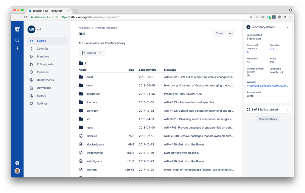
Combined repository overview and source tabs
The repository navigation will no longer lead with the Overview; instead key components of the Overview were combined with the Source browser in order to place focus on primary user actions. No longer will you have to toggle between multiple views in order to view your README and source files.
New right sidebar
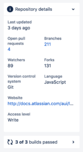
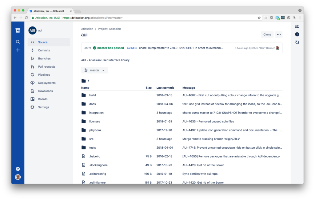
We moved much of the information previously found in the Overview into expandable cards in a new right sidebar alongside build statuses. This new experience offers important information about the repository when needed but is also collapsible so it can get out of your way when you need to focus. Best of all, this new pattern opens the door for a range of new information to be added in the future, and we’re working on add-on extension points so the Bitbucket community can develop and share their own too.

Helpful directory
We’ve supercharged the directory listing for the files in your repository. Navigating between directories and files happens entirely on the client, so the experience should feel much snappier as a whole. “Last modified” information now links directly to the corresponding commit and, even more exciting, we now include information about the most recent commits for both files and entire directories. That large block of whitespace that was once at the top of your repository’s root directory list is now full of useful information.
Single Page Application
The new source browser now operates as a single page app which creates a more responsive browsing experience. Whether you’re navigating to a new file or directory, or switching between the various source, diff or commit history views, you’ll notice that the transitions are faster and snappier than ever.
We're excited to release this new and improved experience in the wild and into your hands. It’s a taste of things to come as we continue to add more wonderful features to the new browser!
